
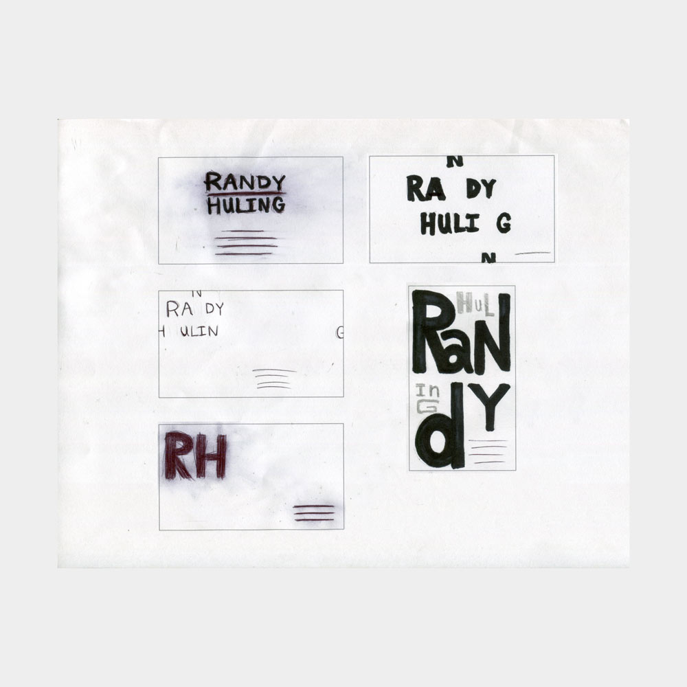
This was the second project for typography one. For this project we were paired up with a class mate to design a stationery system for each other. From the interview we created keywords that linked to each others personality to create a stronger branding identity.


This was my first project during my typography two class. The objective was to pick a typeface and create an informational card set. The cards were to contain information about the typeface and its anatomy based on a theme. For this project I decided to work with Adrian Frutiger's typeface Avenir. Since this is a geometric typeface I chose to use blue prints as my theme. For the final submission we were required to turn in 6-10 cards as well as create an original package design.


For the second project we designed the layout for a coffee table book about Karl Blossfeldt's photography. The main goal of this project was to integrate his images with type. During this project we focused on the hierarchy between heading, subheading, images, body copy, captions, and folio's. For the final deliverable we were to submit a book cover design along with our inside spreads. These below images are only digital mock-ups.


